Profile ·
Your LinkedIn profile photo: how to pick one that actually builds your brand
Your profile photo is the first thing LinkedIn shows of you, even before the headline. It appears in every comment, every invitation, every notification and every search result. If your photo does not match what you offer, the reader leaves before reading a single word.
This guide collects what actually moves the needle: which kind of photo the profiles that work choose, which technical decisions genuinely count and how to take it without looking like a corporate album or a stock photo. If you have had the same photo since 2019, this is probably the highest returning adjustment you can make to your profile today.
By Sheena de PunkVoice · Edited by Mario Pérez
What a LinkedIn profile photo actually does
Before getting into tips, it is worth understanding what job you are asking of the photo. On LinkedIn the image has three simultaneous functions: identifying you (so people recognise you on sight), communicating a level of formality (so the reader senses which register you speak in), and generating initial trust (so replying to a message from you feels safe).
All three operate in under a second. When a profile has a blurry photo, a cropped wedding selfie or no portrait at all, the reader discards it without reading. Not because they are superficial, but because time is scarce and the photo is the cheapest available signal of seriousness.
That explains why two people with equivalent profiles in experience and content get very different message acceptance rates. Swapping a weak photo for a decent one raises invitation responses noticeably more than any headline tweak.
The six photo types you see on LinkedIn and what each conveys
There is a handful of patterns repeated across thousands of profiles. Knowing them helps you position yourself consciously rather than by inertia.
The classic corporate portrait: suit, grey background, uniform lighting. It conveys institutional formality. It works for law, finance and private banking. It weighs against creative or freelance profiles.
The natural portrait with window light: face centred, blurred background, casual or smart casual clothing. It conveys warmth without losing professionalism. It is the most versatile option for most industries.
The photo in context: speaking on a stage, showing a product, on site. It conveys your activity without needing to explain it. It weighs against you when the face is barely visible or when the context dominates the person.
The produced selfie: taken with a phone but with care for light and composition. It works if the industry allows it. On very formal profiles it reads as carelessness.
The photo with brand elements: with a logo, with a slogan painted on the wall, with typography overlaid. It tends to read as excessive ego and reduces trust. Except in very specific cases, better avoided.
The photo cropped from a social event: weddings, parties, holidays. It communicates that you gave it no thought. Unless the industry is very informal, it harms you.
How to match your photo with your headline so both say the same thing
The decisions that matter: framing, gaze, background and clothing
Framing. What works best as a thumbnail is a medium portrait: from mid chest to a few centimetres above your head. If the face ends up too small in the small version (the one appearing in comments), you lose recognition. If it is too large, it intimidates.
Gaze. Looking at the camera generates more initial trust than looking away. Three quarter gazes (slightly averted) work on profiles with a more editorial tone, but they need a technically good photo not to look careless.
Background. A neutral or blurred background puts the focus on the face. Saturated backgrounds or ones with text compete with the gaze and scatter attention. A background with work context works when it reinforces the headline's proposition, not when it merely decorates.
Clothing. There is one practical rule that counts: the clothing in the photo should be at the same level of formality as what you would wear to a meeting with an ideal client. If you sell consulting to banks, a suit or equivalent. If you sell product design to startups, smart casual. If you sell artistic coaching, whatever you actually wear.
What happens when the balance between those four elements breaks is predictable: somebody is left out. A photo with perfect framing and the wrong clothing for your industry costs you as much as a photo with good clothing and bad focus.
Taking it with a phone without it looking like a selfie
Current phones produce more than enough quality for a profile photo. The problem is almost never the sensor, it is the process. A selfie taken on the fly looks different from a considered photo taken with the same phone.
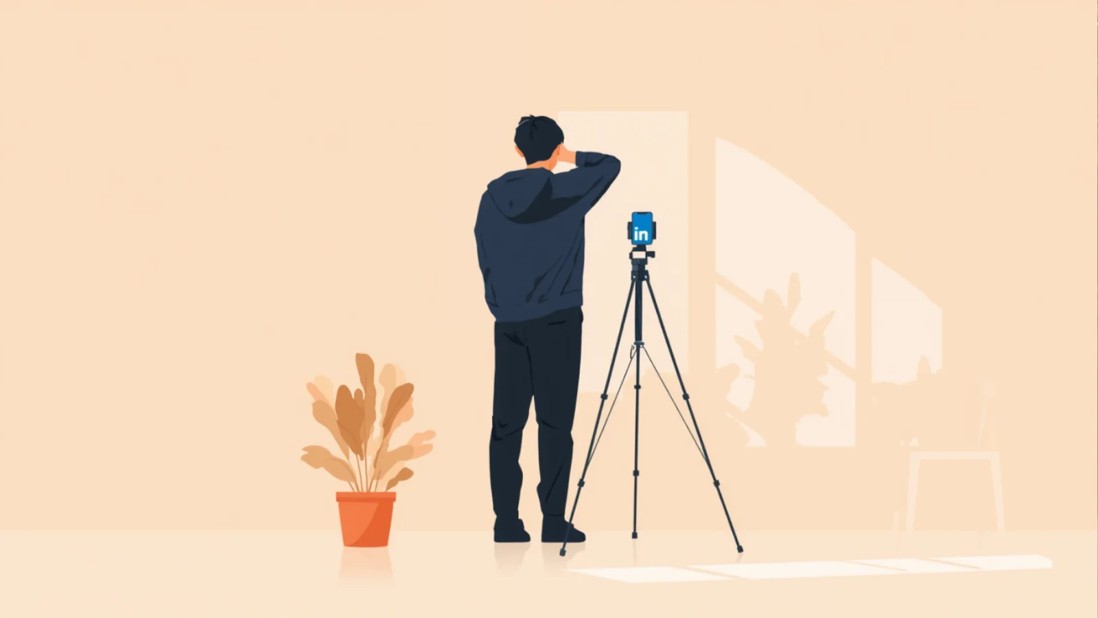
Four decisions that change the result: use the rear camera with the phone propped on something stable or on a small tripod (the front one loses definition), find diffuse natural light from a large window with no direct sun, stand one and a half to two metres from the phone so the perspective does not distort your face, and take at least twenty shots so you have real variety of expression.
The selection matters as much as the shot. The first photo you think is good almost never is. Wait half an hour, come back with fresh perspective, and choose between the best three rather than settling for the first one that clears the bar.
And one non technical detail that makes a difference: ask somebody to make you laugh right before each shot. A genuine expression counts for more than perfect technical settings.
When paying somebody to take the photo is worth it
If your work involves selling professional trust to high value clients per contract (consulting, law, finance, healthcare, executive roles), the difference between a good professional photo and the best one you can take with a phone justifies the spend. We are talking a few hundred euros for a portrait that lasts three or four years.
If your personal brand operates in creative or technology sectors where excessive production can read as posturing, professional photography can even hurt. An over-polished photo on a profile defending imperfection and prototypes creates noise.
And there is an honest middle option: asking somebody you know with a good eye (they do not have to be a photographer) to do the session with your phone on a bright morning. The difference from a selfie is enormous and the cost is buying them a coffee.
Mistakes that cost you credibility
A photo several years old. People recognise old photos. When somebody meets you in person after reading you and the face does not match, trust suffers. As a rule, if more than three years have passed or your appearance has changed noticeably, it is time to update it.
An over-retouched photo. Uniform skin, overlit eyes, over-whitened teeth. It reads as artificial and, on profiles defending authenticity, it contradicts the message.
A photo generated or retouched with AI. It is starting to show. The over-perfect lighting, the odd details in hair or jewellery, the impossible symmetry. If whoever reads you detects AI in the photo, they transfer that suspicion to the text you wrote.
A photo with several people or cropped from a group. Even if you mentally point an arrow at yourself, the reader takes a moment to work out which one you are. You lose the critical fraction of a second.
A photo with sunglasses, a hat or a face covering. They limit facial recognition and reduce trust. Except in very specific cases (profiles related to outdoor sport, for example), they add less than they seem to.
A photo of a pet instead of you. Affectionate, but it communicates that you do not take the profile seriously. Save the dog for your banner if you want to include it.
How often to update the photo
There are three clear moments to change it: when more than three years have passed since the current one, when your appearance has changed noticeably (a haircut, glasses, weight, age) or when your industry has shifted and the photo's formality no longer fits.
Outside those cases, it is not worth touching often. Your network's visual memory takes time to consolidate, and constant changes dilute you.
What is worth doing once a year is looking at your current photo with a stranger's eyes. Ask yourself what somebody landing on your profile for the first time would make of it. If the answer is ambiguous, you already have your reason to book the session.
Adapting the photo to your industry without falling into stereotypes
Every industry has an implicit visual expectation. Breaking it works if you do it consciously. Breaking it out of carelessness penalises you.
In consulting, banking, law and finance, the expectation is a formal portrait with a suit and a neutral background. A photo that is too casual reads as unprofessional. Breaking it only makes sense if your whole positioning defends an alternative approach (a consultant selling going against the grain, for example).
In technology, product and design, the expectation is smart casual or casual with good photographic judgement. A rigid suit can read as out of date or as corporate posturing.
In creative fields (advertising, content, audiovisual, illustration), there is room for personality: colour, gesture, context. That said, the photo still needs intent. Being creative is no excuse for carelessness.
In heavily regulated sectors (healthcare, institutional legal work, public education), a photo that is too informal can generate rejection for reasons unrelated to your ability. Basic formality remains an asset.
The reasonable protocol when in doubt: look at twenty profiles of people you admire in your industry, observe the common visual pattern, and decide whether you want to align with it or whether you have an argument for standing apart.