LinkedIn profile ·
LinkedIn's Featured section: what to pin at the top of your profile for your goal
The Featured section of a LinkedIn profile is the shop window that appears right below your About section. It is the first thing a visitor sees after reading the three lines of your headline, and one of the highest returning parts of a profile in 2026, precisely because most people ignore it or fill it with no criteria at all with their last three posts.
This guide explains what to pin at the top depending on your real goal (selling a service, building topical authority, job hunting, activating a community) and what never to put in that section however tempting it is. With concrete examples of which structure works for each profile.
By Sheena de PunkVoice · Edited by Mario Pérez
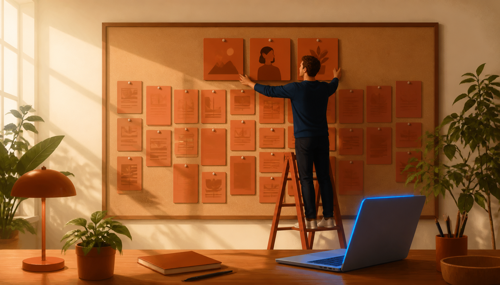
What Featured is and what place it actually occupies on the profile
Featured lets you pin up to six pieces of your choosing to the profile: your own posts, articles, external links, PDF files or images. It appears right below the About section on desktop and in the second scrollable block on mobile. In 2026 LinkedIn's mobile interface shows the first piece as a large card and the next three as small horizontal cards.
The practical consequence is that the first piece has a far greater impact than the rest. It is the only one a casual visitor definitely looks at, and often the only one they ever open. Positions two and three get opened if the visitor has already decided to take your profile seriously, and positions four to six, in practice, are only looked at by people with very high interest (recruiters, potential partners, journalists).
The average profile's mistake is letting LinkedIn auto-fill this section with the latest posts published. That setting turns Featured into a miniature feed, with no criteria, and cancels out its shop window function. Turning it off and choosing the pieces by hand is the first decision that separates a worked profile from an inert one.
What to pin at the top depending on your real goal
The most common configuration mistake is pinning "the best I have" without asking what for. A viral post does not sell a service, a client case does not hunt for a job and a long article does not activate a community. The first piece in Featured has to serve the specific goal you have this quarter.
- Goal, selling a service: first piece = your own sales page (Notion, website, PDF) explaining in under two minutes what you do, who for and how to hire you. Second and third = a real client case and a post with testimonials grouped together.
- Goal, building topical authority: first piece = your most argued article or post on the topic you want to be known for. Second and third = two more pieces on the same topic to signal it is not an accident.
- Goal, job hunting: first piece = a short post or document summarising what you are looking for, in what format and what you have done before. Second and third = a verifiable case or project and a link to a portfolio, LinkedIn Learning or relevant certifications.
- Goal, activating a community: first piece = the event, newsletter or community you run. Second and third = one piece of content that gives a flavour of it and a link to the channel where the conversation actually happens.
What never to pin in Featured
There are four kinds of piece that often show up in Featured and that in 2026 subtract more than they add, regardless of your goal. It is worth reviewing them and removing them before configuring anything new.
- Standalone posts with no context for why they are pinned: if a new visitor does not understand why that specific post is a calling card, it is not one. Move it back to the feed and let it go.
- Links to websites you no longer maintain or that have not been updated for months: on opening them, the visitor infers your digital presence is neglected.
- Heavy or badly laid out PDFs: they download slowly, look mediocre on mobile and, unless they are clearly useful to the goal, give a sense of improvisation.
- Collections of logos or "I worked with these brands" with no concrete case behind them: they read as empty boasting and give the visitor no reason to message you.
Why the first piece decides more than it seems
In the mobile view, which in 2026 accounts for 65% to 75% of traffic to non-commercial profiles, the first Featured piece takes up almost the full screen width with a large image and a visible title. The next three appear as small horizontal cards you have to swipe. On desktop the effect is smaller, but the first piece is still the only one visible in full with no extra scrolling.
That means the first piece works as a calling card in itself. If a visitor arrives at your profile from a comment of yours on someone else's post, it is very likely the only content of yours they see is the title and image of that first card. Everything else depends on them deciding to stay.
The practical consequence: choose the first piece deliberately, give it a good image or thumbnail (LinkedIn shows the post's first image or the link's Open Graph image) and review each quarter whether it still serves your current goal. Positions two to six are far less critical and can be rotated with less ceremony.
Order, rotation and healthy maintenance
The order is edited by hand from the section itself: LinkedIn lets you drag pieces to reorder them and hide them without deleting. Healthy rotation means reordering every three months according to the quarter's goal, not every week. The sense of a living profile comes from the feed, not from Featured. Changing Featured every time you publish something new creates noise and strips the genuinely important pieces of their hierarchy.
Minimum maintenance means checking every six months that the external links still work, that the thumbnails look good on mobile, and that the pinned pieces still represent what you do today. Any piece that no longer makes sense after six months goes. Three strong pieces beat six with filler.
One under-exploited operational tip: take advantage of the fact that an external link (your site, your Notion, your Substack) generates its thumbnail and title from the destination page's Open Graph tags. Writing a deliberate Open Graph title and a bespoke image for that page multiplies the visual impact of the corresponding Featured card, with nothing to redesign inside LinkedIn.
How to measure whether Featured is working
LinkedIn gives no dedicated statistics for the Featured section, but it does give three useful indirect signals. The first is total weekly profile views, which respond with a 7 to 15 day lag to configuration changes. If reordering Featured makes them rise, something was wrong with the previous order.
The second is clicks on pinned external links (Notion, your own site, a portfolio): those show up in the destination site's analytics and are the best proof the piece is pulling. A link pinned in first position that gets no visits in six weeks is not doing its job, however good the content.
The third, more qualitative but very reliable, is the contact messages you receive on LinkedIn. When somebody writes specifically mentioning a case, an article or a service you have pinned, you know Featured did its filtering job. When all the messages are generic, the section is not providing the context it should.
How to write an About section that works for you while you sleep
Featured is the only block on the profile you curate yourself
LinkedIn caps the headline at 220 characters. The About section answers to a long text. Experience is chronological. Recommendations depend on other people. Featured, by contrast, is the only block where you decide without restrictions what to show and in what order. It is your curatorial space inside the profile.
Used well, that space makes a new visitor understand in twenty seconds what you are after and what you can offer them, without needing to open a post or leave the profile. Used badly (auto-filled with your latest posts, cards with no criteria), it is noise competing with your About section without adding anything. The difference between the two is fifteen minutes of good decision making, not five hours of work.